

A Pioneer of Graphic Design
In the fertile creative crucible of Manchester in the late 1970s, Malcolm Garrett emerged as a force in graphic design, recognizing the profound impact of visuals on musical identity. Born in Northwich, Cheshire, in 1956, and educated at St Ambrose College, Garrett’s time at Manchester Polytechnic (1975-1978) placed him at the heart of a burgeoning artistic scene. Sharing classrooms with future design icon Peter Saville and the provocative artist Linder Sterling, Garrett’s trajectory was set—to redefine the visual language of music.
Early Career: Deconstructing Punk Aesthetics Through Modernist Precision
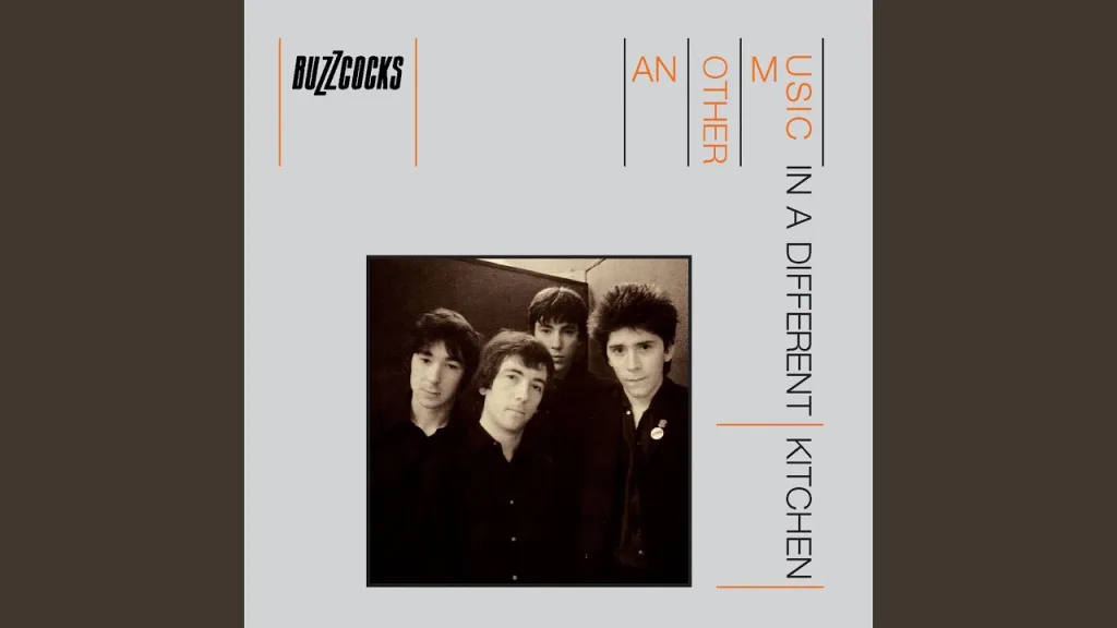
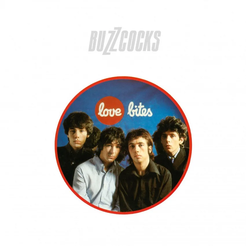
Garrett’s early work with punk and new wave bands, particularly Buzzcocks, served as a radical departure from the prevailing visual tropes of the era. His album covers and single sleeves, exemplified by “Another Music in a Different Kitchen” (1978) and “Love Bites” (1978), presented a stark, minimalist aesthetic that challenged the established visual chaos of punk. Instead of embracing the raw, cut-and-paste collage style often associated with the movement, Garrett opted for a refined, modernist approach. He employed a rigorous grid system, clean typography, and a limited color palette, demonstrating a keen understanding of the power of negative space and visual hierarchy. This deliberate rejection of punk’s expected visual language wasn’t merely stylistic; it was a conscious articulation of his belief that visual identity should possess the same level of intellectual and emotional impact as the music itself. He essentially subverted the expected visual grammar of punk, using modernist techniques to create a more impactful message. This experience honed his ability to distill complex musical ideas into clear, compelling visual narratives, a skill that would prove invaluable in his later collaborations, where he would further refine and elevate the visual branding of artists into iconic representations of their respective musical landscapes.
The Visual Language of Duran Duran
By 1980, EMI recognized Malcolm Garrett’s unique ability to translate musical ethos into compelling visuals, and recruited him to shape the visual identity of their rising stars, Duran Duran. This band, spearheaded by founding members like bassist John Taylor and keyboardist Nick Rhodes, were at the forefront of the burgeoning New Romantic movement, a scene that blended art-school sensibilities with a flair for theatricality and glamour. Though Garrett’s design roots were firmly planted in the punk and new wave scenes, he quickly grasped the band’s ambitious aesthetic vision. As he recalled, capturing the essence of John Taylor’s initial concept:
“Taylor’s influence had been The Sex Pistols’ track Anarchy in the UK and a song by disco band Chic. He had this idea that his band should be a merger of the two – dance-orientated and futuristic mixed with we’re-in-control-of-our-own-destiny rebelliousness.” (Source: Malcolm Garrett Interview, Design Week)
Garrett Understood the Importance of Immersing Fans in a Complete Visual World
Garrett’s role in Duran Duran’s visual narrative extended beyond traditional graphic design, evolving into a comprehensive creation of cultural artifacts. His five-year tenure saw the meticulous crafting of album covers, single sleeves, logos, promotional materials, and merchandise, each designed to maintain a unified, yet evolving, aesthetic. This approach recognized the fan as not merely a consumer, but a participant in the band’s constructed reality. By immersing fans in a complete visual world, Garrett blurred the lines between artistic expression and commercial branding, creating a potent form of fan engagement:
“Part of the secret of successful music packaging is for the fans to believe that the band does everything.” (Source: Creative Review)
Malcolm Garrett’s Duran Duran Discography & Designs Styles
Singles:
- “Planet Earth” (1981) – Garrett conceptualized a futuristic, aviation-inspired design using National Geographic landscape images. He aimed for an aesthetic that felt expansive yet structured, setting the stage for Duran Duran’s evolving style.
- “Careless Memories” (1981) – A continuation of the structured grid aesthetic, utilizing Perry Haines’ photography.
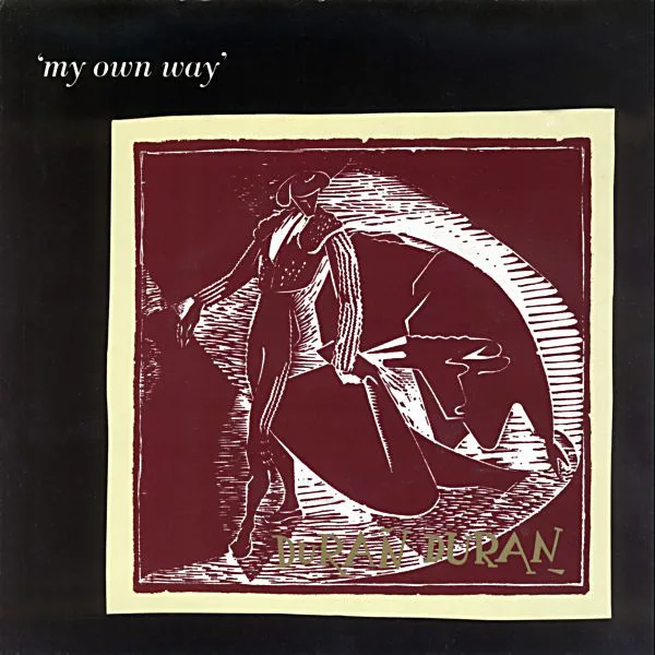
- “My Own Way” (1982) – A rare collaboration between Garrett and Peter Saville. While Saville introduced the bullfighter theme, Garrett provided the underlying structural composition.
- “Is There Something I Should Know?” (1983) – Known for its distinctive blue-and-yellow cube design, inspired by Russell Mulcahy’s music video.
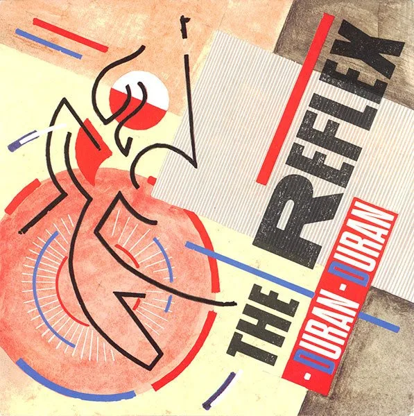
- “The Reflex” (1984) – A constructivist-inspired design, influenced by conversations with Nick Rhodes.
- “A View to a Kill” (1985) – Integrated the James Bond aesthetic with sleek, minimal typography.
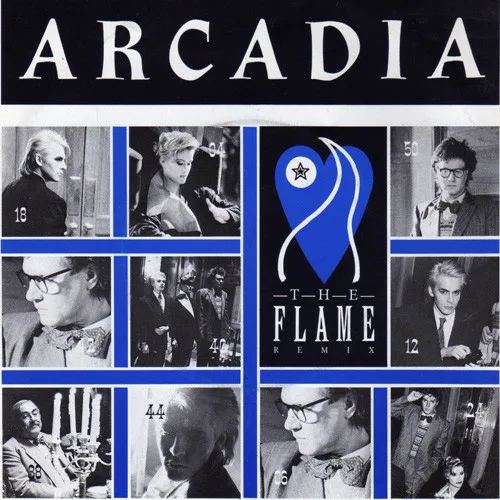
- “The Flame” (1986) Arcadia
Albums:
- “Duran Duran” (1981) – Embodied minimalist elegance, setting a foundation for the band’s visual storytelling.
- “Rio” (1982) – Featuring Patrick Nagel’s painting, Garrett ensured the cover framed the artwork effectively. He carefully color-matched the band’s attire with the typography and inner sleeve designs, reinforcing a luxurious and polished aesthetic. (Source: Design Observer)
- “Seven and the Ragged Tiger” (1983) – A collaboration with Keith Breeden, featuring layered esoteric symbolism, maps, and intricate iconography.
- “Arena” (1984) – A multimedia package that extended beyond an album cover to include films, books, and even a board game, reinforcing the band’s global brand.


Faith in These Colors
The creative dynamic between Garrett and Duran Duran transcended a typical client-designer relationship, evolving into a genuine artistic partnership. He forged particularly close working bonds with Nick Rhodes and John Taylor, both of whom possessed a keen understanding of the band’s visual identity and were deeply involved in its development. This synergy fostered an environment where ideas flowed freely, and a shared intuition guided their creative decisions. As Garrett himself observed:
“My instincts matched theirs, and I can’t recall having to submit ideas that were discussed or thrown out or modified.” (Source: Malcolm Garrett Interview, Eye Magazine)
Beyond Duran Duran: Lasting Impact on Design
While his work with Duran Duran is among his most celebrated, Garrett’s influence extends across various industries. He founded Assorted Images, an influential design studio, and later co-founded Images&Co, applying his expertise to technology, branding, and public-sector projects. His firm has collaborated with institutions like the BBC, Science Museum, and London’s Design Museum.
Garrett was an early adopter of digital design tools, transitioning from traditional methods to digital platforms in the 1980s. His embrace of technology helped shape modern graphic design practices. His work often incorporated strong typographic elements and symbolic imagery, drawing from modernist influences like the Bauhaus movement.
Recognized for his contributions to the field, Garrett was named a Royal Designer for Industry (RDI) by the Royal Society of Arts. His work has been exhibited at prestigious institutions like the V&A Museum and MoMA, showcasing his lasting influence on visual culture.
Garrett’s Lasting Influence on Visual Culture
A Synthesis of Modernist and Postmodernist Aesthetics
Garrett’s work with Duran Duran transcended mere album covers, functioning as a comprehensive exercise in world-building. His designs didn’t merely reflect the band’s music; they amplified it, creating a tangible connection to the band’s carefully constructed aesthetic. Garrett’s approach synthesized elements of modernist graphic design, particularly the clean lines and geometric forms reminiscent of the Swiss Style, with postmodernist sensibilities, characterized by pastiche, appropriation, and a playful deconstruction of visual conventions. This can be seen in the juxtaposition of minimalist layouts, as in “Planet Earth,” with the more elaborate, collage-like constructions of “Seven and the Ragged Tiger,” which evoke the layered narratives of Dadaist photomontage. Garrett’s use of Patrick Nagel’s illustrations for “Rio” exemplifies a postmodern appropriation of high art, merging the stylized elegance of Art Deco with the slick, consumer-driven aesthetic of the 1980s. His employment of the grid system, a hallmark of modernist typography, provided a structural framework for the band’s visual identity, while his incorporation of diverse visual elements, from found photography to custom typography, added layers of meaning and complexity. This balance between formal rigor and eclectic experimentation set new standards for music packaging, demonstrating the power of design to create immersive, multi-layered visual experiences that resonated deeply with a generation.
In the words of Garrett himself:
“It should have the necessary potency but be suitably timeless.” (Source: Eye Magazine)
References:
Eye Magazine: Interview with Malcolm Garrett
Malcolm Garrett Interview, Design Week